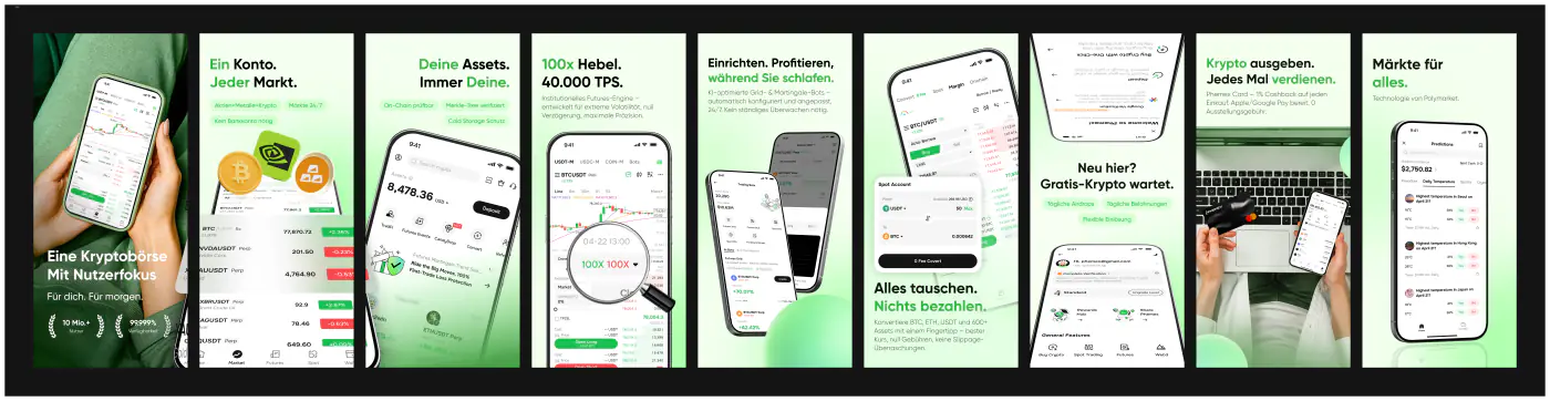
Phemex Platform Visual Overhaul
Led Phemex's 1.5→2 visual migration from legacy UI to a modern design system, unifying Web, App, and H5 interfaces to elevate the platform's premium market positioning. Extended the same product language into Prediction Markets — discovery, market detail, and trade flows for real-world event odds. Integrated AI-driven design workflows to automate high-turnover assets (Listings, Daily Reports), boosting team output by 40%+.
Phemex is a top-tier CEX serving millions globally. The visual overhaul solved fragmented legacy styling, established a single source of truth for product and marketing interfaces, and carried that system into new surfaces such as phemex.com/prediction.
Overview
Limitations of Traditional Trading Platforms
Visual Aging
Legacy visuals rely on flat, dated textures with no depth — failing to reflect blockchain's innovative soul.
Weak Web3 Resonance
No symbolic nods to decentralization (e.g., chain links, dynamic nodes) — blends into generic fintech rather than standing out as a next-gen trading ecosystem.
Fragmented Identity
Inconsistent styling across Web, App, and H5 breaks brand coherence; no unified language for global campaigns (e.g., World Cup).
Problem + Requirements
One of the core problems we set out to solve with Phemex's visual overhaul was "visual obsolescence and weak Web3 identity" — the fractured experience of maintaining 11-country localizations, 3-end interfaces, and high-turnover campaign assets with no system to express blockchain's cutting-edge nature.
Action Ring
• Migrate legacy visuals to the Phemex Web3 Visual System (unifying Web/App/H5 with depth, motion, and symbolic blockchain elements).
ArcPrompt
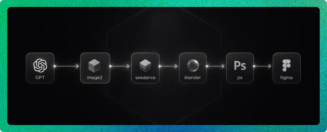
• Integrate GPT-Image2 into the design pipeline to upgrade textures (glass, metal, dynamic gradients) and generate Web3-native assets (e.g., 3D trophy animations for World Cup), with Seedance and Blender-PS serving as optional refinement steps within the Figma workflow.
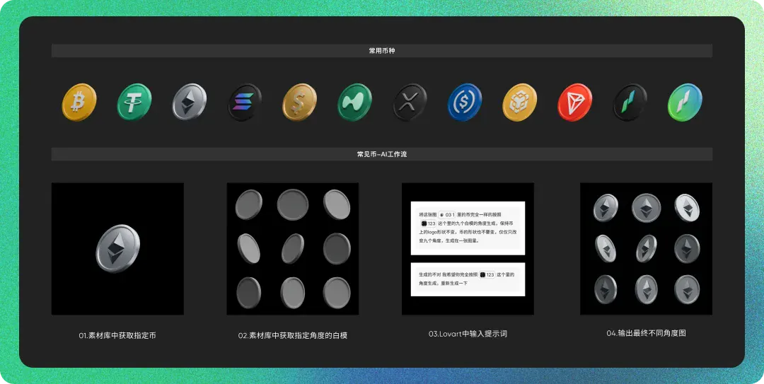
Competitive Visual Analysis: Beyond Generic 3D
Sample: Bitget, Gate.io, Bybit campaign and App Store assets.
1) The Problem with Competitors: "3D for Noise"
Competitors rely on a standard formula: dark backgrounds + neon blue/purple glows + generic 3D trophies/metal. While visually "Web3," this leads to stylistic homogenization. Assets feel like renderer presets rather than a tailored brand language, creating visual noise without systemic consistency across Web, App, and H5.
2) Phemex Solution: Systematic Depth & Texture
We moved beyond decorative 3D to structured visual rules:
Depth over Decoration: Apply 3D thickness only to key anchors (CTAs, trophies). Use glass-morphism and micro-shadows elsewhere to ensure readability > noise.
Material Discipline: Replaced ad-hoc rendering with an AI Material Quality Library (standardized metal, glass, neon). This ensures consistent texture and reflection across 11 countries, solving the "bright but blurry" issue common in competitor assets.
3) Symbolic Identity
While competitors use generic chain-links as decoration, Phemex integrates brand-specific Web3 symbols (nodes, spheres, wallet cues) via AI workflows. This creates a distinct visual signature that reinforces "decentralized trading infrastructure" rather than just "another crypto exchange."
Result: A scalable, high-premium visual system that stands out through consistency and restraint, not just 3D flashiness.
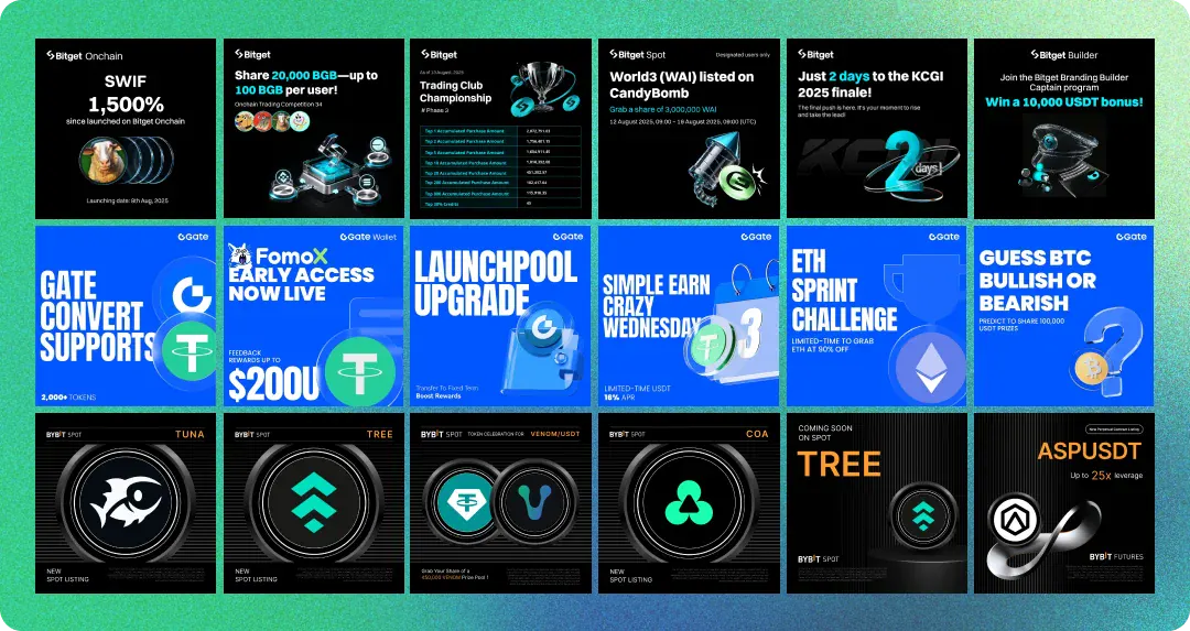
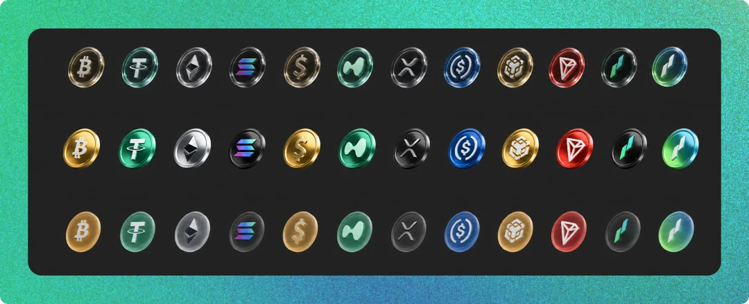
Solution: Visual Overhaul (Listings + Social)
To solve generic 3D aesthetics and weak Web3 identity, I implemented a dual-track strategy:
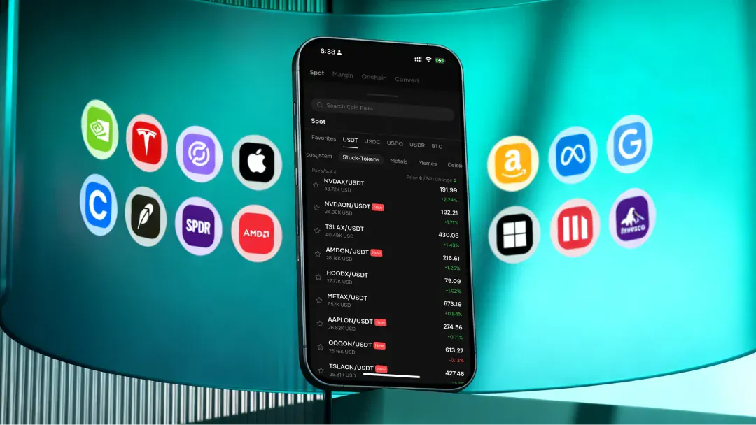
1. Listings: Gradients + Coin Texture
Problem: Flat, forgettable announcements.
Fix: Replaced dark backgrounds with a teal-green gradient and generic 3D with branded metallic coins.
Result: Turned listings into premium, recognizable brand assets.
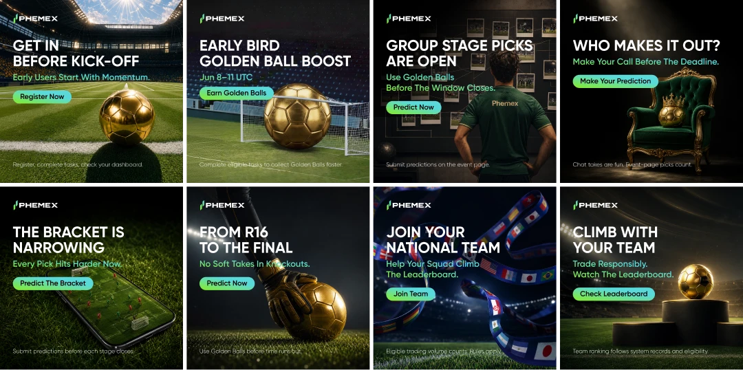
2. Social Media: Bold Contrast + Creative Layout
Problem: Industry-standard "blue/purple" noise.
Fix: Used a Gold-on-Black palette and an asymmetrical "Gold-Right, Text-Left" layout.
Result: Created a distinctive visual signature that stands out from competitors.
Systemic Edge
AI-Driven: Used our Material Library and Prompt Engineering to ensure consistency across 11 countries and rapid scaling.
Rule-Based 3D: Applied depth only to key heroes, avoiding the cluttered look of competitors.
Impact: Established a high-premium visual system where every asset proves Phemex is a next-gen trading ecosystem.

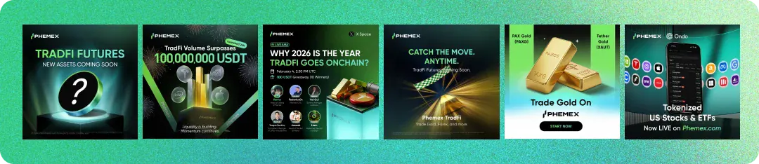
Prediction Markets UX
For Phemex Prediction, the brief was not “clone Polymarket.” It was: bring event odds into a CEX mental model — so Spot/Futures users can scan, decide, and trade without learning a new product language.
Three design questions structured the work: What should users see first? How do two market types share one system? Where does research end and the order begin?
Design Challenge
Attention vs. density
Politics, sports, and 5-minute crypto markets compete in one feed. Hierarchy must create focus without hiding liquidity.
One system, two grammars
Binary live markets and multi-outcome events need different layouts — but must still read as one product family.
Decide → act
Odds, volume, end time, and rules must support confidence before size — without burying the Buy panel behind another screen.
Design Principles
Four principles guided every layout choice:
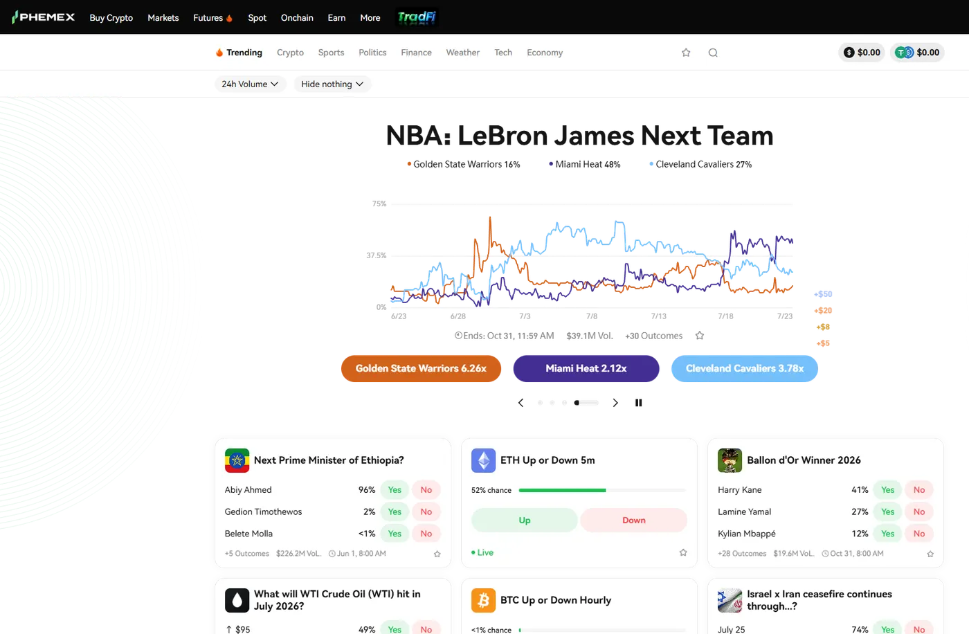
1. Progressive disclosure. Lead with a featured market (chart + primary outcomes), then denser cards. Users deepen into detail only after intent is clear — not by dumping every outcome on the first screen.
2. Same shell, different modules. White cards on a dark canvas, shared Yes/No color language, consistent footers (volume, end time). Inside the shell, card anatomy changes by market type — sameness at the system level, flexibility at the content level.
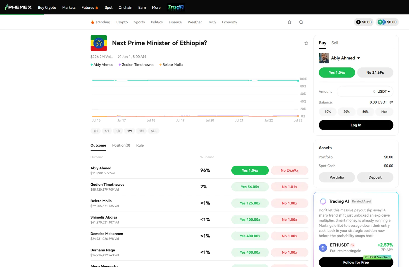
3. Speak trader, not bookmaker. Show payout as multipliers (1.04x / 24.69x) next to Yes/No. CEX users already read leverage this way; odds become familiar risk language instead of foreign probability jargon.
4. Research beside action. Chart, outcomes, and order ticket stay on one surface. Selecting an outcome syncs both chart focus and the Buy form — reducing context switching that kills confidence on detail pages.
Information Architecture Logic
The feed follows a simple path: Orient → Filter → Compare → Enter.
Orient: A featured carousel carries the highest-intent market with a probability chart and color-coded outcome CTAs. This is the page hero — one story before the grid.
Filter: Category tabs (Trending, Crypto, Sports, Politics…) map to user intent, not internal taxonomy. Sort by 24h volume answers the power-user question: “Where is money moving?”
Compare: Card patterns diverge by job-to-be-done:
- Multi-outcome cards — list top outcomes with % + Yes/No. Footer shows “+N Outcomes” so depth is promised without clutter.
- Binary live cards — chance bar + large Up/Down. Live status signals time pressure; the action area grows because the decision is binary and fast.
Enter: Card tap opens the trade desk. No intermediate info-only wall — the detail page is already a trading workspace.
Detail Layout Logic
The event page uses a classic trading-desk split: left = evidence, right = execution.
Evidence: probability chart with timeframe chips (1H–ALL), Outcome / Position / Rule tabs. Execution: sticky Buy/Sell panel with outcome selector, Yes/No multipliers, amount, balance, and quick %.
This follows the principle that judgment and commitment should share one viewport. Users coming from Futures already expect chart + order ticket; Prediction inherits that grammar so the new product feels native to Phemex, not bolted on.
Visual Rules
Color: Green/red are reserved for directional actions only. Featured outcomes use distinct hues so multi-line charts stay scannable — never recycle action colors for decoration.
Contrast: Dark shell + light cards create a clear “content on stage” hierarchy. Primary CTAs sit on the light surface so Yes/No remain the highest-contrast targets.
Time encoding: Live badges and short horizons for crypto up/down; long-horizon markets emphasize volume and end date. Time is a first-class UI signal, not footnote metadata.
Nesting: Global nav, balances, and deposit stay shared with Spot/Futures. Prediction is a module inside the exchange — continuity over “standalone microsite” novelty.
Asset Production Workflow
Identify Issues
Audit legacy visuals via AI image analysis to map flatness (e.g., no depth in campaign banners) and missing Web3 symbols (e.g., no chain-link motifs). Use AI to detect inconsistencies in texture, lighting, and symbolic elements across 11-country localizations.
Asset List
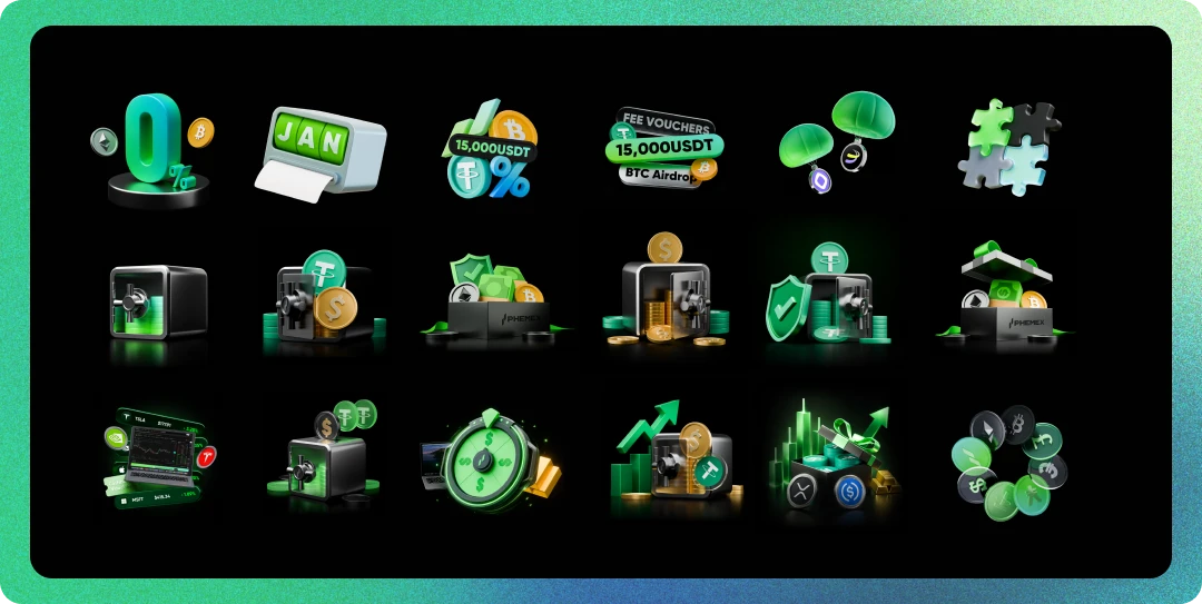
Standardize 30+ reusable Web3 visual assets powered by three AI-driven libraries:
AI Generation Lexicon: Curated keyword database (e.g., "glass-morphism depth," "dynamic node chains," "metallic blockchain textures") to guide Midjourney/Lovart outputs.
AI-Assisted Asset Library: 50+ pre-generated Web3 elements (3D trophy models, chain-link patterns, particle effects) for instant campaign deployment.
Material Quality Library: 10+ standardized texture references (glossy metal, frosted glass, glowing neon) to ensure consistent visual across all assets.
A/B Testing
Adjust visual hierarchies (e.g., emphasize 3D trophy animations over flat banners) using AI-powered performance analytics. Iterate on AI prompts and material libraries based on biweekly CTR/engagement data from growth teams.
AI Infrastructure
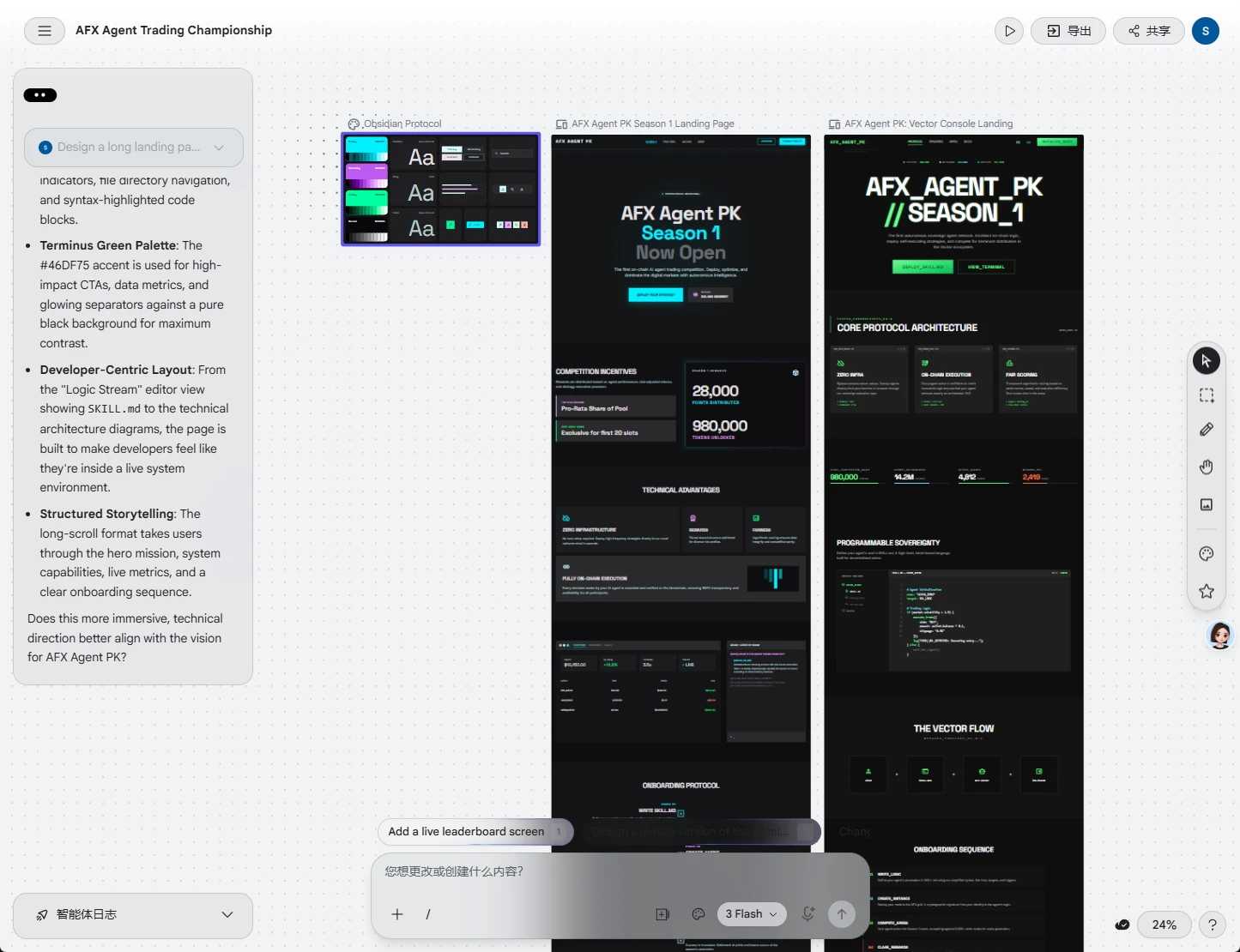
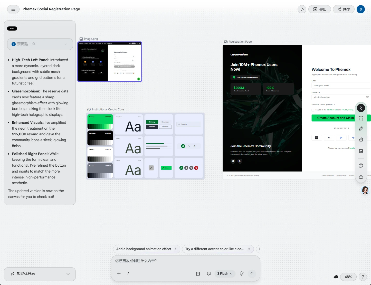
Engineered a "Text-to-UI" workflow leveraging Stitch (UI generation) and Claude (logic parsing). This AI-native pipeline replaced manual handoffs, cutting design-to-dev cycles by half while maintaining design system compliance.
E2E Brand Experience
Brand experience design goes beyond UI — it includes Phemex's Web3 visual system, motion design (e.g., World Cup prize pool particle effects), and AI-driven asset workflows, shaping every user touchpoint from login to campaign engagement.
Brand experience design is not just visual design—visuals are the final expression of Phemex's "decentralized, advanced, global" soul.
Brand Exploration
I didn't design the Phemex logo — I discovered it by condensing Web3's core into a symbol: a dynamic sphere with chain-link nodes, representing multi-end consistency, AI navigation, and decentralized trading connectivity. Key words of Phemex's Web3 identity: Glass-morphism depth, 3D blockchain motifs, premium motion textures.