
Game UI Design Portfolio
A complete TG Mini App UI system covering core gameplay, profile, inventory, quests, equipment, upgrades, leaderboard, and onboarding—from information architecture to micro-interactions, with attention to UX at every touchpoint.
Design Overview
This portfolio showcases a TG Mini App UI built around a collect-and-grow core loop. The visual language uses a warm base with high-contrast information hierarchy, emphasizing instant feedback and emotional expression. Each module is designed independently yet unified under one system, so players move smoothly between scenes.
Profile System
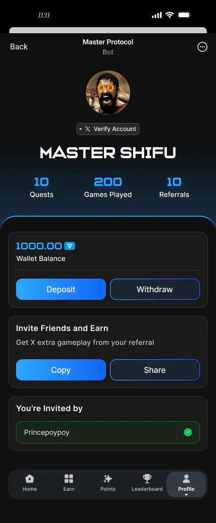
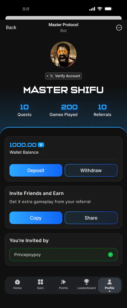
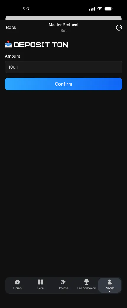
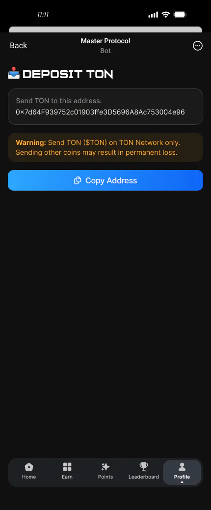
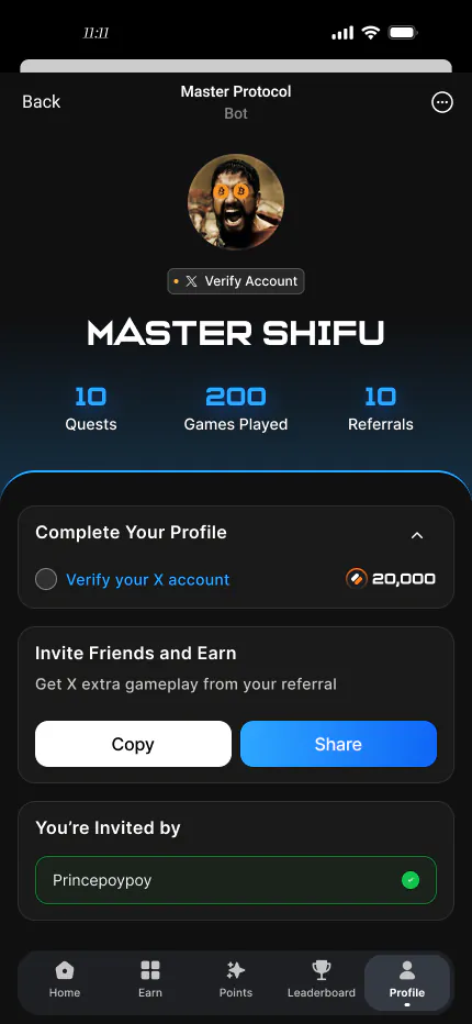
Twelve profile states cover everything from default to max level, normal to edge cases. Each state keeps the same information hierarchy while using subtle visual differences to signal change.
Base Information Architecture
Avatar, basic info, stats panel, achievements, and recent activity. A text-left, numbers-right layout supports quick scanning. The avatar frame dynamically reflects the player's current tier.
- Clear layers: identity → data → activity
- Avatar frame evolves with level to reinforce progression
- Stats use progress bars plus numeric values
Multi-State Adaptation
The same profile page adapts visually across levels, gear, and achievements. Color and badge systems convey differences without rearranging layout, keeping the mental model stable.
- Level changes affect values and frame color only—not layout
- Achievement badges add visual richness
- Higher tiers add light effects without hurting readability
Deep Customization States
High-tier profiles add custom backgrounds, effect badges, and title systems. Saturation and motion are controlled so decoration never overwhelms core data.
- Title and background combinations enable differentiation
- Exclusive effects stay on the avatar area, not full screen
- Every custom element shows clear unlock requirements
Low → High Growth Path
Twelve state slices from starter to max tier show the full visual growth curve. Each step feels distinct enough to give players a clear sense of goals.
- Color saturation increases step by step
- Frame complexity grows with tier
- Avatar + data structure stays consistent throughout
Core Gameplay Screens
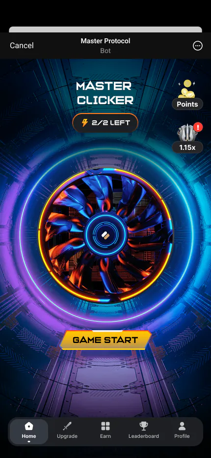
The tap-to-play home screen is where all interaction starts. Built around tap-to-collect, it combines hit areas, real-time feedback, and progress incentives in one viewport.
Tap Interaction Design
The tap target sits in the lower half for one-handed ergonomics. Each tap triggers animation, floating numbers, and progress—forming a clear cause-and-effect loop.
- Tap targets ≥ 60px for high tolerance
- Floating numbers fade upward without blocking taps
- Segmented progress bar drives short- and long-term motivation
- Top resource bar updates live and never blocks the tap zone
From Play to Management
Bottom navigation links the home screen to inventory, equipment, and more. Sub-pages share the same hierarchy and language so switching between play and manage stays low-friction.
Inventory System
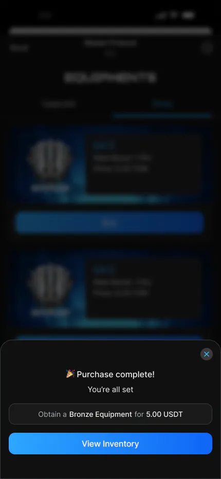
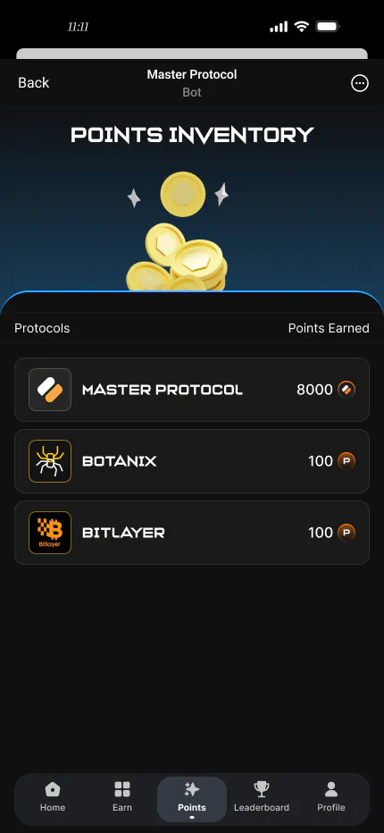
Inventory is the core container for collectibles. Three view states cover overview, detail, and filter/action flows.
List → Detail → Action
Grid cards show icon, name, rarity color, and quantity. Detail pages support use/sell/craft with sensible depth progression.
- Consistent card spacing for stable rhythm
- Rarity colors unified across screens (green/blue/purple/gold)
- Detail view shows full stats plus source hints
- Empty and full states both have clear visual cues
Quest System
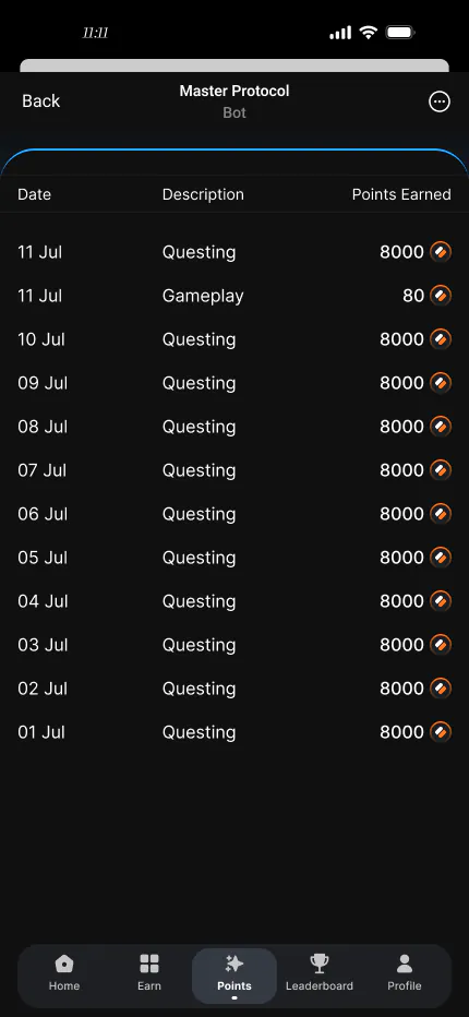
Quests drive long-term engagement. From list to detail, every state communicates progress and the next action clearly.
Quest List Design
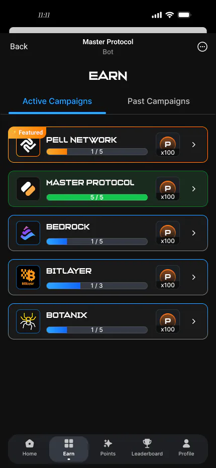
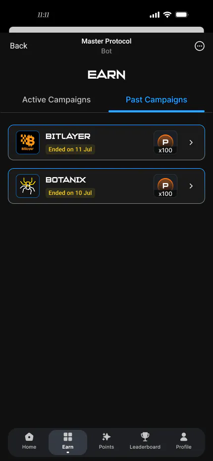
Quests group by type (main/daily/event) in collapsible cards. Progress bars and reward previews help players prioritize without opening detail.
- Bold group headers; unified cards within each group
- Each quest shows name, progress, rewards, and actions
- Go buttons jump directly, reducing steps
- Completed quests gray out and move to the bottom
Quest Detail & Multi-Step Quests
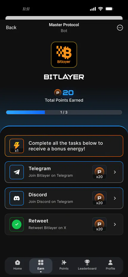
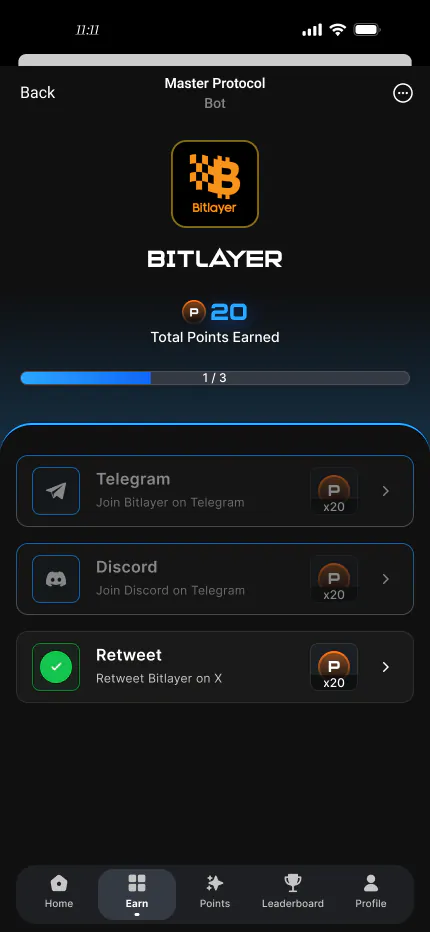
Detail splits into background, step list, reward preview, and actions. Multi-step quests show progress so players always know where they are.
- Progress bar reflects overall completion
- Steps listed individually with check states
- Rewards preview as icon + count for quick reading
- Non-auto quests show a Go button
Equipment System
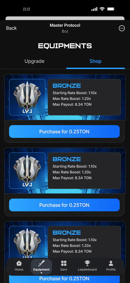
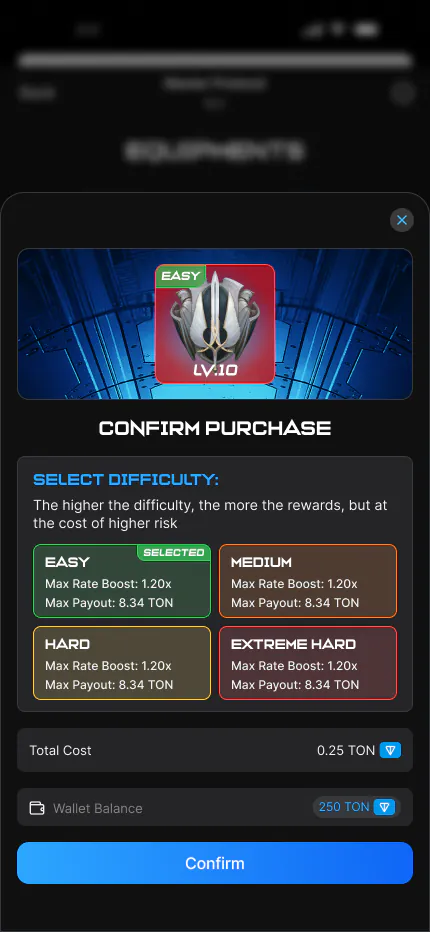
Equipment is the core power-management panel. Character-centered layout with gear around the avatar boosts immersion while keeping swaps efficient.
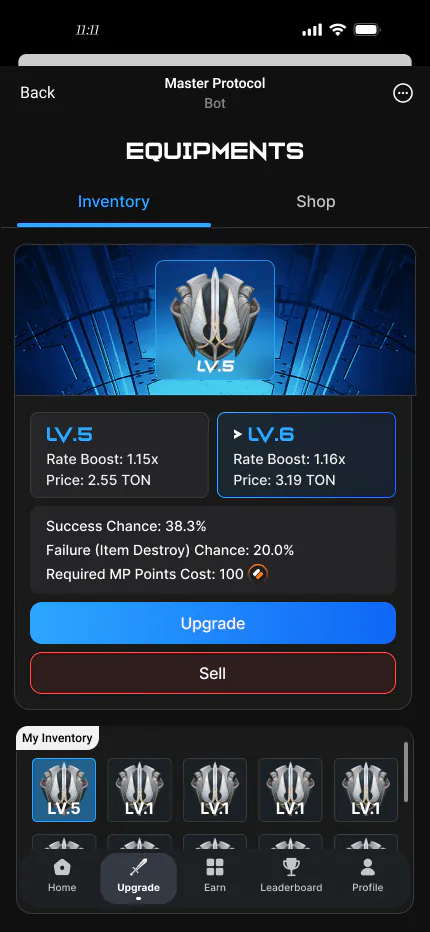
Manage & Replace Gear
Character art is centered; slots map to body parts. Selecting gear shows stat comparison below. Locked/equipped states use visual overlays.
- Slots arranged by body part (head/body/hands/feet/weapon/accessory)
- Stat comparison uses green (up) and red (down)
- Equipped items labeled in inventory to prevent duplicates
- Empty slots use dashed frames and icon placeholders
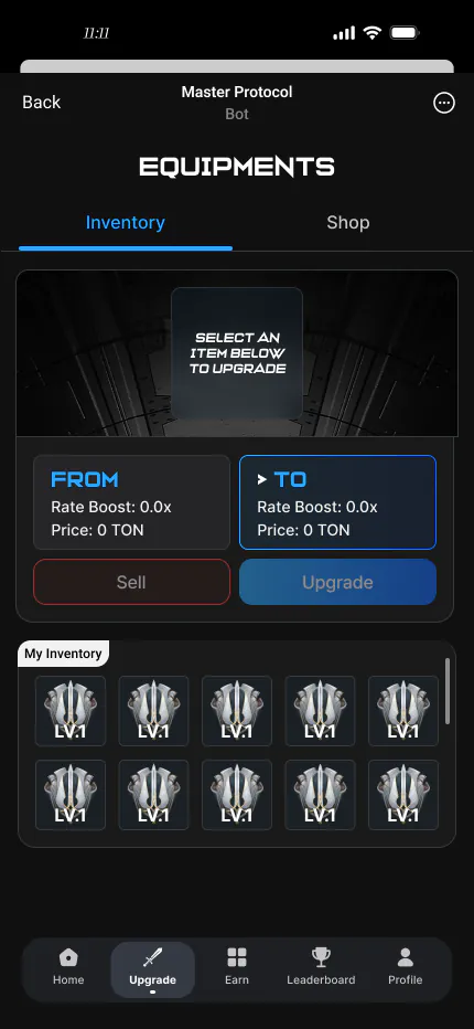
Stats & Upgrade Preview
Detail shows full stats, set bonuses, and upgrade preview in base → bonus → set → upgrade reading order.
- Primary and secondary stats in separate sections
- Set bonuses highlighted; missing pieces show completion goal
- Upgrade preview slider shows gains before committing
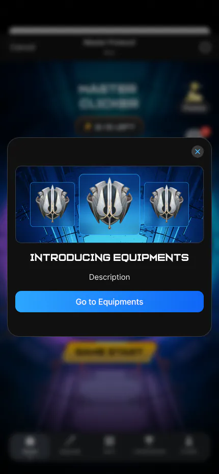
Upgrade System · Full Feedback Loop
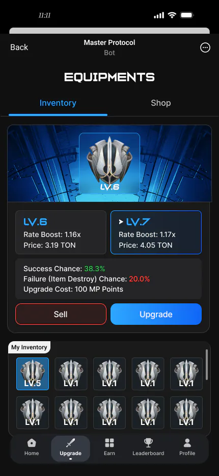
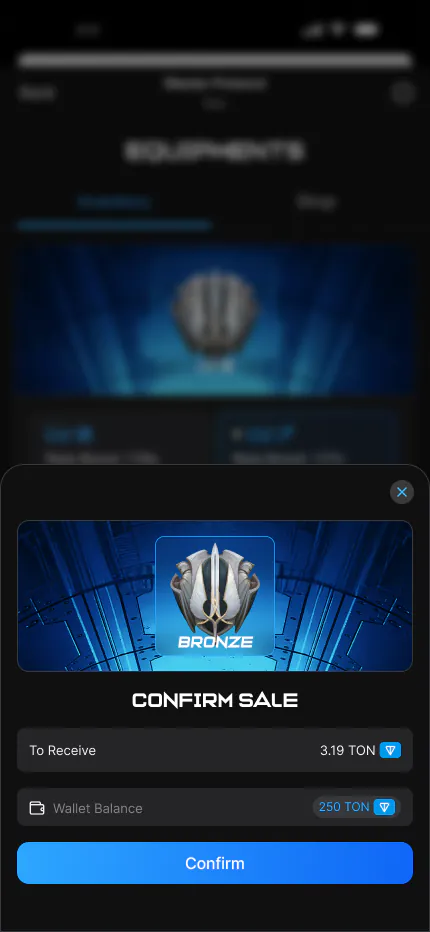
Upgrades need the most emotional design. From confirm to execute to success or failure, five outcome states form a complete risk-reward chain.
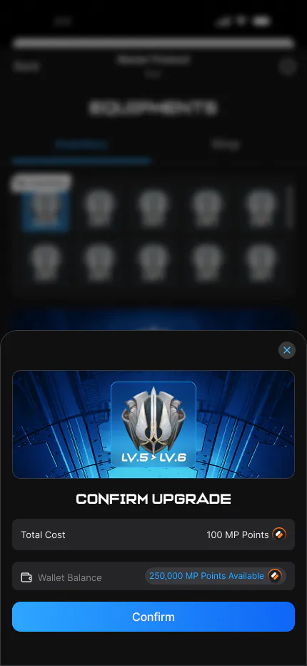
Upgrade Confirmation Modal
Modal shows current vs upgraded gear, cost, and success rate. Modal pattern prevents mis-taps. Probability uses color coding for quick risk read.
- Side-by-side: current left, upgraded right
- Cost icons with sufficient/insufficient states
- Ring chart plus percentage for probability
- Confirm/cancel buttons with clear visual weight
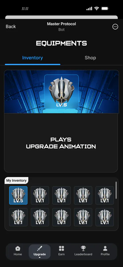
Upgrade Animation & Wait
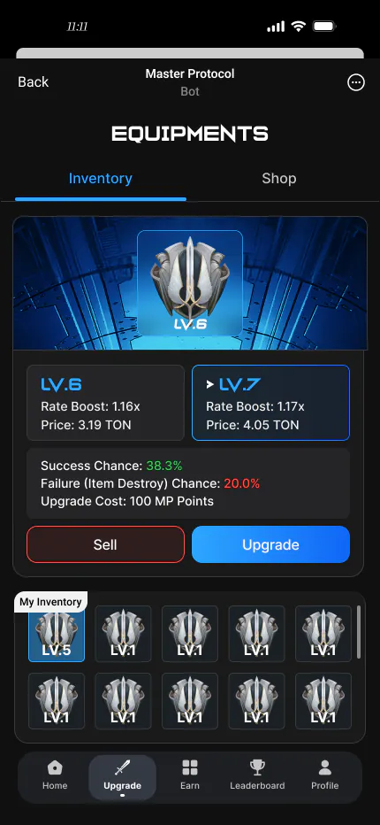
After confirm, a 1.5–2s animation adds weight without frustration. Progress bar and shimmer convey processing.
- 1.5s duration balances anticipation and speed
- Particles and shimmer build tension while luck resolves
- Non-skippable to preserve result ceremony
Three Success Tiers
Three success tiers—normal, great, and jackpot—escalate effects, particles, and typography so lucky moments feel memorable.
- Normal: single-color glow + standard copy
- Great: dual-color glow + scale animation
- Jackpot: full-screen particles + haptics + special copy
- All success states share layout; decoration differs
Designing Negative Outcomes
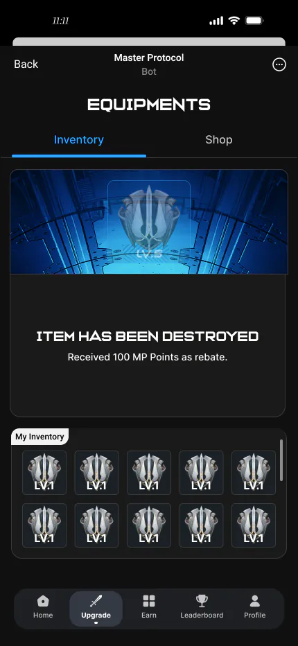
Failure and destruction are the cost of high-risk actions. Dark tones and shatter animation convey loss while retry and protection items reduce churn.
- Fail: muted tones + no-upgrade message
- Destroy: shatter animation + special SFX (dev required)
- Both outcomes offer clear next actions
- Protection items are introduced before risky actions
Leaderboard
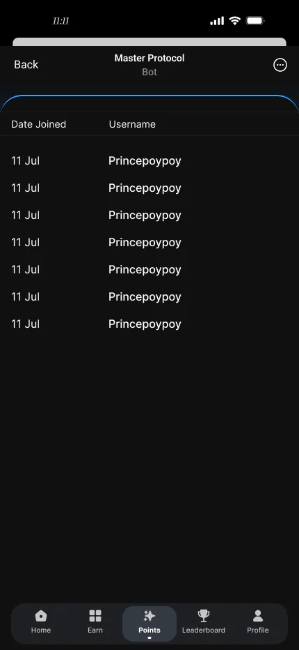
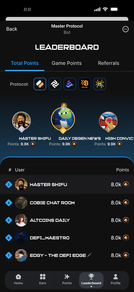
Leaderboards are the hub for social competition—highlighting your rank, rank changes, and scannable rival info.
Live Rankings & Tiered Display
Top three get hero cards with trophies; others use a compact list. Your row is highlighted; arrows show rank movement.
- Top three use large cards and effects for prestige
- Your row uses brand-color highlight
- Rank arrows (↑ / ↓ / —) at a glance
- Point gap shown to motivate catching up
- Fixed My Rank footer for constant self-position
Onboarding & Icon System
Onboarding is the first retention gate; icons are the visual vocabulary of the UI. Together they shape first impressions.
First-Run Experience
Progressive disclosure—one concept per step—with spotlight masks. Page indicators reduce uncertainty about length.
- One concept per step to avoid overload
- Spotlight + dim overlay for clear focus
- Skippable with progress—respects player agency
- Illustrations match world art to reduce friction
Unified Visual Language
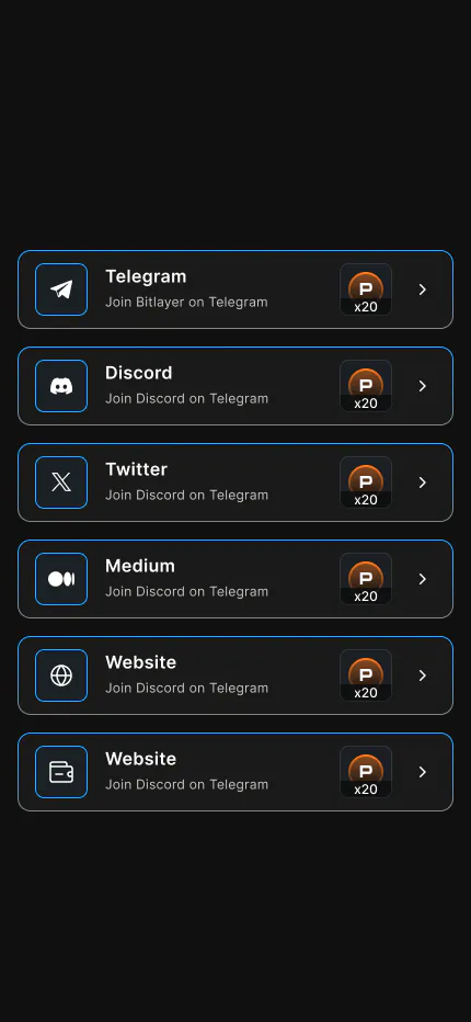
Icons cover resources, actions, navigation, and states with consistent line-and-fill style, radius, and stroke weight at every size.
- Line-and-fill style stays legible at small sizes
- Unified 2px stroke and 2px corner radius
- Resource icons color-coded by rarity
- Filled icons for nav; line icons for actions
Design System Summary
Color System
Warm base (#FBF6EE) with deep brown text (#201914) and brand accent (#9B5B32). Rarity colors unified everywhere: common→green, rare→blue, epic→purple, legendary→gold.
Typography Scale
Display titles use Georgia serif; body uses Inter sans. Type scale 12/14/17/20/28/42/64px with clear hierarchy.
Component Library
Buttons, cards, modals, progress bars, and tabs share radius (10–24px), 1px borders, and shadows. All interactive components cover normal/hover/pressed/disabled.
Design Principles
- Consistent — Same elements look and behave the same across pages
- Feedback — Every action gets visual/motion response within 200ms
- Clear — Hierarchy over decoration; players grasp the screen in 3 seconds
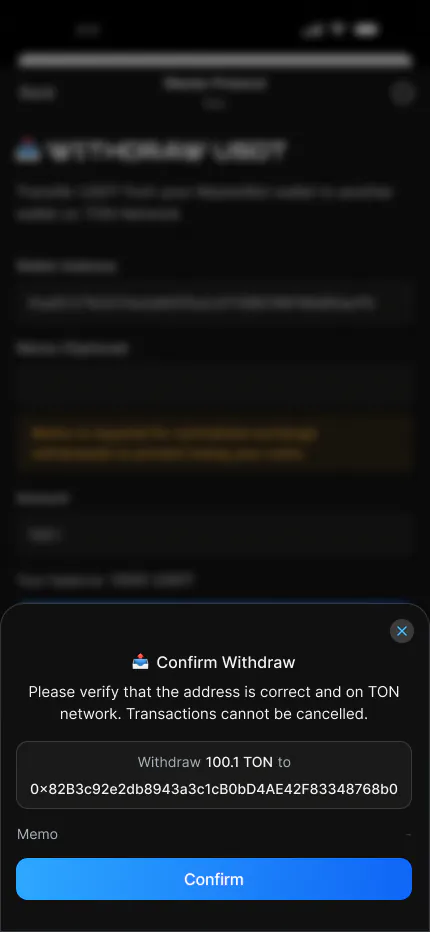
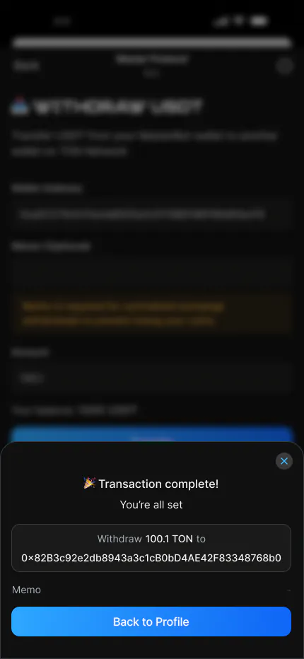
- Forgiving — High-risk actions require confirm plus undo/protection
Interaction Principles
Minimum 44×44px tap targets. Motion 150–250ms with cubic-bezier(0.2, 0, 0, 1). Page transitions slide to preserve spatial continuity.
Accessibility
Icon buttons include text labels. Color never carries meaning alone. Supports system text scaling. Minimum 4.5:1 contrast (WCAG AA).
Performance
UI depth capped at three layers (background → content → overlay). Motion uses transform/opacity only. Assets exported at 1× and 2×.
Future Extensions
- Dark mode: extend color tokens from the existing system
- Motion library: unified enter/exit/loop patterns
- i18n: text containers sized for multiple languages